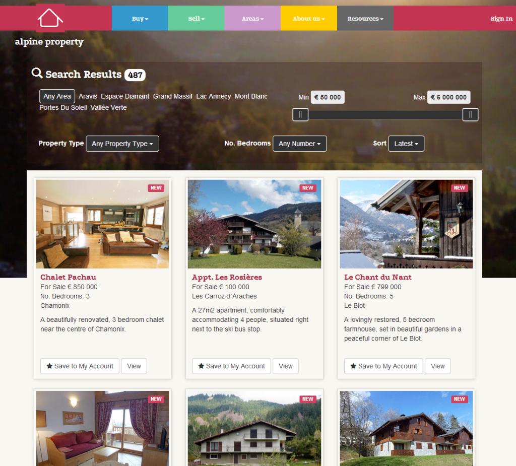
Alpine Property has recently launched v4 of the website. As usual we are keeping up with current technology and have made a website that will adapt to all the various devices that are being used nowadays. Mobile phones, tablets (big and small), laptops and massive screens too. With this milestone in mind I decided to look at our websites over the years.
To give a bit of a timescale.
- AOL mail went online in 1993
- Amazon in 1995
- Hotmail in 1996
- BBC online in 1997
- Google in 1998
- Facebook 2004
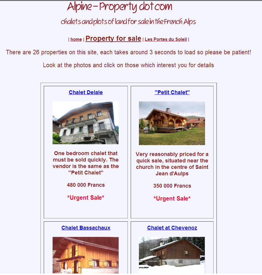
v1, Spring 2000 the first Alpine Property website
Built by Steve Norris (now the MD of Alpine Property) for Claudia Buttet, built and maintained with Dreamweaver. One fat finger could render the whole site useless!

v2, Spring 2002
Already technology was leaving us behind so we brought in a professional database programmer and intranet master. This website was dynamically driven (Microsoft ASP), text heavy and image light. Still designed with dial-up modems in mind.

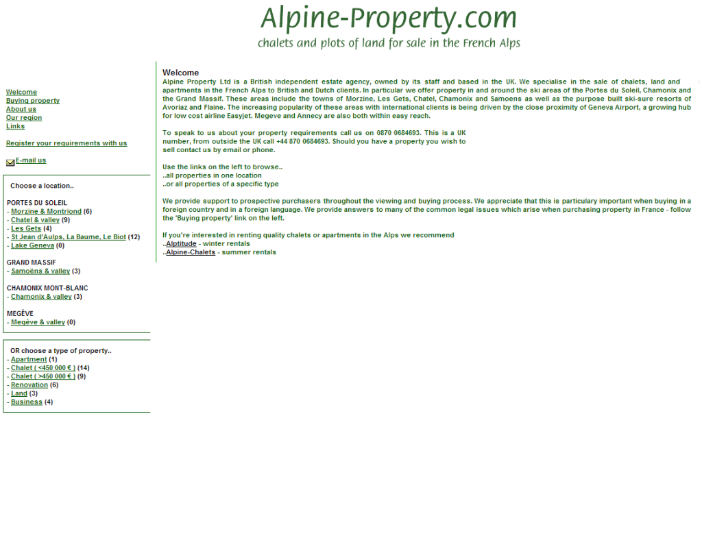
v3.0, Spring 2005
We moved onto our own dedicated server, changed to PHP and designed the site with broadband connections in mind. The same programmer did the technical stuff, the look of the site was the brainchild of Alex Lewis (our marketing man) and a big-shot in the advertising world.

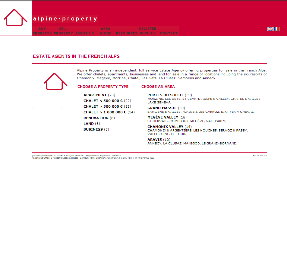
v3.5, Spring 2009
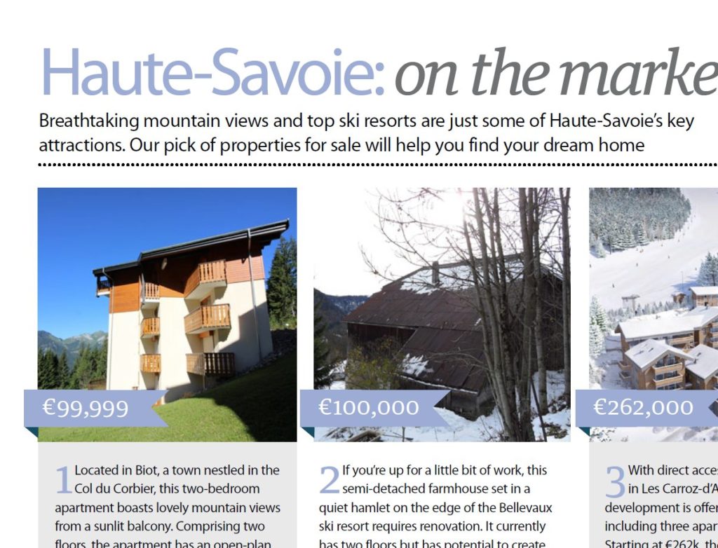
A mild update to the look but a massive update to the back-end, Lehman Brothers went under in September 2008 . This caused the property market to stall over the following winter. We had time on our hands so after a reappraisal of what we were doing we decided to diversify from the UK market and have everything professionally translated into French and Dutch.

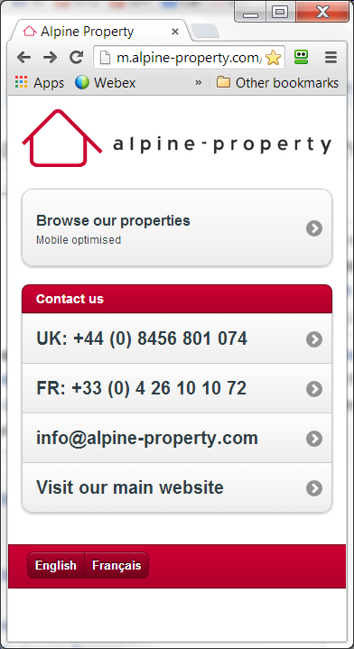
Winter 2012 Mobile site created
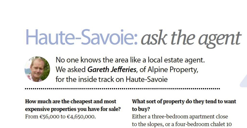
It became clear that many of our customers were accessing our website on their mobile phones. We’ve always liked to stay ahead of the game when it comes to technology so we commissioned a mobile version of our website. Designed to be super fast to cut down on roaming charges and compatible with all devices be that Apple or Android. It was very successful too. If we ever needed a low-bandwidth version of our website we’d all turn to this one!

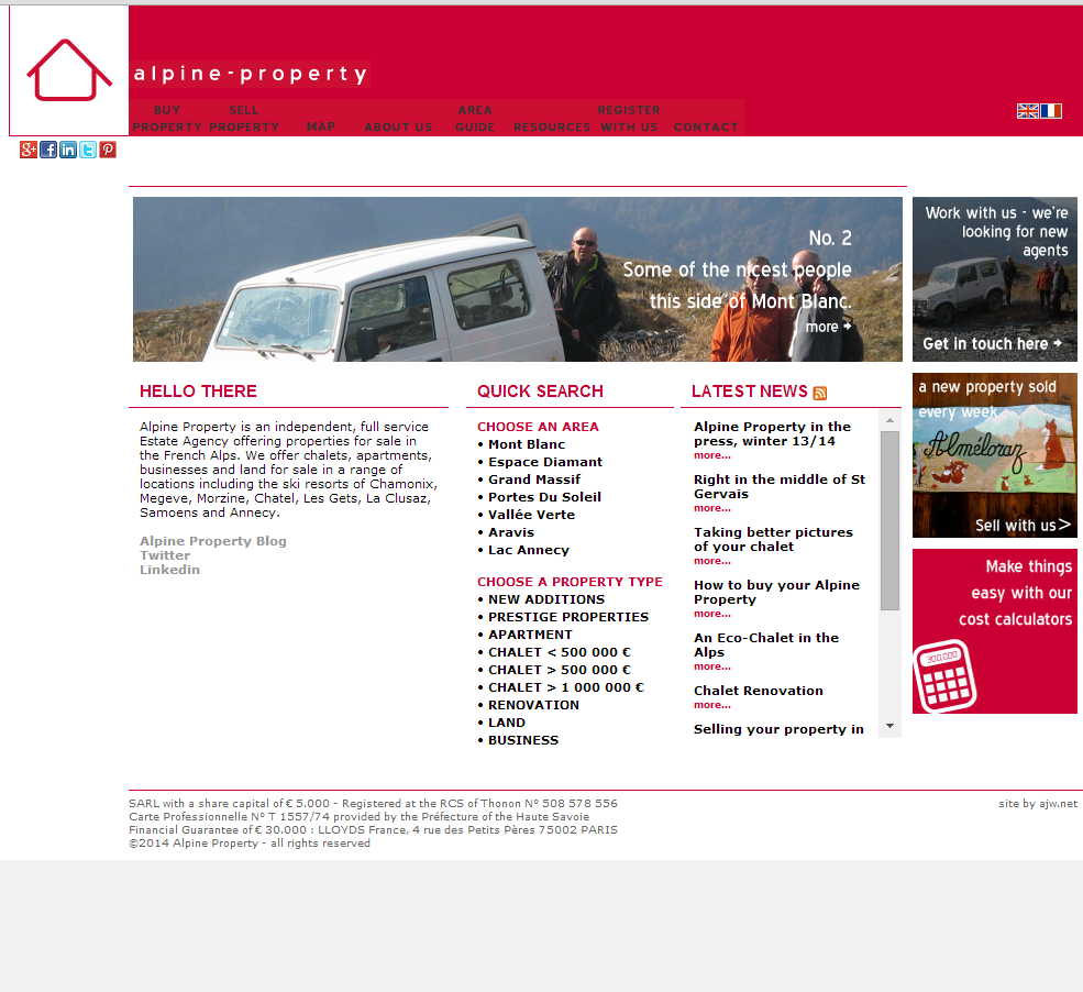
V4, Spring 2014
The way people access the web has moved on again; at is usual lightning pace! Our clients are now using mobile phones, tablets (big and small), laptops and massive screens too and the technology of websites is moving on to accommodate this. The architecture of our database has remained the same but the website needed new technology, a new programmer was brought in to apply his skills with Bootstrap to create a Responsive website. Alex Lewis came up with the base design again. In total we put 7 months work into this, exchanged over 2,000 emails, had dozens of web conferences and numerous face to face meetings, it’s also the first website we beta-tested on users before release.
